Saturday, June 30, 2018

Health Care Forum July15


HOSTED BY 
Greene County Action NOW!
Mountain Top Progressives
Greene County Chapter NY Progressive Action Network

Invite you to a community workshop on the

New York Health Act
Assembly Bill A04738

Presented by Katie Robbins 
Executive Director of the Campaign for New York Health

Sunday, July 15     1:30-2:30pm
Cairo Public Library 
15 Railroad Avenue    Cairo, NY


We have never been so close to securing universal, single-payer
Healthcare for Every New Yorker!

The bill has passed the NYS Assembly three years in a row, 
and a near- majority of the State Senate is now in support. 

We need you to call your NYS Senator and tell them to fight for this legislation…

This workshop will provide the facts you need to make that call, and help make history!


Whether you are for or against, come learn how New Yorkers will benefit:


Comprehensive coverage
Freedom to choose providers
Fair funding:  Equality of Care
Decreased administrative costs
Reduced cost of drugs and devices


and
What you can do to support passage of the bill!

www.GreeneCAN.org             www.mtpny.org  

Tuesday, June 18, 2013

Big Move....

I am excited to report that I have moved my blog to a more "inclusive" location. "Inclusive" because it does not require a degree in computer science or a commitment to spending hours on the internet every day. Here is what you do:
You go to http://blog.tashadepp.com/
Then, you notice that at the very right hand bottom of the page, there is a "FOLLOW" button. (If you are already a Wordpress user, you will find the "FOLLOW" button on top bar where it always is...)
Click on it and type in your email address in the pop-up window.
Yo u are done except for one simple remaining thing: you will receive an email from "Wordpress" and you must simply confirm that you want to follow my blog.

I really appreciate your patience with following these hopefully simple steps. You will not be required to "Join" anything" or sign up with any service. You will receive my blogposts in your email and to comment on the blog, all you have to do is click on "comment".

Please let me know if any of this is confusing or doesn't work for you.

Keep in mind that I had to engage my senior technical advisor of a son to forge this new path and make sure that all the previous posts came with me to the new location, not to mention, that the new posts will still appear as the front page of my website....he was very generous and kind to help me.

Lastly, I am already much happier with this new blog situation as I see mention of posts by other people that tie in with my post subjects. I feel as though I was blogging away in a dark closet by myself with literally only 2 people who could forge through the barriers to post comments now and then, and now I am out in the light of day and there is a potential sea of people who may share insight into the things I am concerned with in my posts....

Join me at http://blog.tashadepp.com/ to see what happens!


Monday, May 13, 2013

John Singer Sargent and I

applying a coat of zinc white (mostly avoid the lead these days) atop two thin layers of animal skin glue
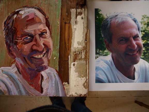
 A woman contacted me to ask about having her portrait painted in a Victorian dress that she had a black and white photocopy of. She wanted the dress to be blue. She mentioned having photos of herself that I could work from. I asked to see the visual material. She sent me photos off of an i-phone. The photos of her were small, but clear. She had a beautiful smile....the image of the dress was a different story. It was a rather  worn photocopy and difficult to see any detail on the dress. It appeared to  be a painting of a woman in a Victorian dress.

I began to worry about how I would come up with a believable Victorian dress, and I decided to look in the local community college library, which happens to have a good art book section. "John Singer Sargent" popped into my head and I thought to myself that he had created portraits of women in dresses around that time period...so I pulled a book of his paintings off of the shelf and checked it out. I was looking at it for the third time about a week later, beginning to feel panicky about how to design a light blue Victorian gown, when all of a sudden, I turned the page in the book past a dress that almost looked right, and spotted a painting that pictured the identical image from the black and white photocopy. Except, most puzzlingly, it was cropped slightly different...the painting in the book had more space above the figure's head....I wondered wether the b/w photocopy was a copy of a copy....but anyway, I had found the dress! I looked it up on-line and printed out a beautiful 8"x 10" photo of the painting. Not only did this give me brush stroke information about how to create the dress, but it presented a pretty believable warm-hued background.

Blocking in background and foreground areas
 The painting looked like the client from the moment I started sketching her in.
Committing to the background

The completed portrait
At the client's request, we replaced a "clutch" for what seemed to be a bud vase in the figure's front hand. It was really fun paying such detailed homage to the Sargent painting...I found myself quite interested in the white shape slightly behind the figure...is it a pillow case cast to the floor? Why did Sargent think that this disordered element was a good idea? Or perhaps more significantly, why did he want such a noticeable white shape in that spot?Maybe to simply direct the viewer's eye along the top diagonal so as to take the viewer's gaze under the sofa and behind the figure? Maybe this is what gives the painting it's lively sense of depth?

This woman's family were all involved in obtaining updates on the portrait and then making sure it was beautifully framed for her for mother's day. I wasn't sure whether to tell her husband when I met him to hand off the portrait, how small my expectations for my own mother's day were. Not much fanfare at my house. "If I was lucky," I finally told him, "my youngest son would bring me coffee in bed. That was about it." We both chuckled.

As it turned out, I was wrong. My youngest son coerced his older brother to help bake me a cake. So I had a mother's day cake! (but no coffee in bed)


Friday, April 26, 2013

Living With the Far Right


I asked my son to take this photo out the car window thinking that it exemplified the down side of living in the rural area where we live. The car was wallpapered with pro-life Christian bumper stickers. And as if to further demonstrate the singleminded determination of the owner of the vehicle, the car looked as though the driver might frequently literally push other viewpoints right off the road. 

Once I was past the ripe age of about 12, I stopped wanting to wear my beliefs on my sleeve. I have stuck a few bumper stickers on the backs of cars I drove over the years, but they mostly asked more questions than they answered. I have found that most issues that people argue about cannot be fairly represented by anything that fits on a bumper sticker. Also, I have always been one to understand that the other person may come from a different belief system, so a simplified sentiment on a bumper sticker doesn't allow for their entire orientation.  

It is a real challenge for me to think about the owner of this vehicle with sympathy and compassion. They just seem ridiculous, like a cartoon character. On the other hand, I am regularly exposed through my teaching job at the community college to students and others with similar Christian viewpoints who I do have respect for. They feel that life begins at conception, and that it is therefore wrong to end the life of an unborn baby.  I can allow that they have a point if you believe that life begins at conception. If you don't believe that, you could feel differently. As long as anti-abortionists are actively assisting young poor mothers with childcare, financial assistance and emotional support, I can't argue with their beliefs. If they are simply ramming other viewpoints off the road, well, that is another story.

Wednesday, April 24, 2013

A picture says more than a thousand words?

A total of 13 portraits were completed.

This gentleman regards his portrait for the first time.
The artist "lets go" of one of the portraits (painted on a motorcycle helmet visor) to it's recipient.

A young subject has grown a year older since her photo!

Portrait smortrait?


Wednesday, April 17, 2013

Another Day, Another Portrait Or Over-riding Disney

Once again, soooo exciting starting this one, with the lavender baby magically arising
 out of the disney-esque fairy landscape....


I went at it some more after this session.....will post finished one soon.
 And then there is the one I finished last week...probably the most difficult one of all.  Look at the expression on that little schoolgirl face. She is trying to care about having her picture taken and maybe aware that past years have not yielded proper results. This year, once again, she is full of ambition to arrange her face in an acceptable way, but it just isn't working out once again. My rendition of her expression communicates her trepidation, but with less of the resigned gentle anguish. It was really hard to capture that resigned gentle anguish. Maybe I'll snatch more minutes before Friday when I hope to hang all these portraits to see if I can just soften some edges and get her a little less definite in her expression....Maybe if I could articulate in words what it is that her face is expressing....

Monday, April 8, 2013

Opening Strategies vs. Endgame

   Coming down the homestretch with only (counting slowly in my mind....) 6 or 7? "free" portraits to complete in the next 2 weeks, (YIKES!) I am taking a minute to post photos from the portrait I started 2 weeks ago. This portrait was "commissioned" on a wonderful chunk of wood with a history, and I had been given a fabulous digital photo of the gentleman in question to work from. I was looking forward to starting!
    As always, the beginning of a painting is the most exciting part to me. I would go so far as to say that the trajectory of my painting career has been the slow teaching of myself how to sustain the excitement and attention to detail and signals throughout the entire painting, all the way to the bitter end. I have of late been thinking of the end of the painting as the endgame, just like in chess. I am not much of a chess player, but I can assure you, as in painting, my opening game is much more accomplished than my endgame, when my brain hurts and there are too many details to follow up on and several pieces are already in jeopardy; it just makes me want to go eat a sandwich and read a book.
    As I was saying, there is almost nothing as exciting as starting a new painting. It bursts with possibility and decisions and openings...it is akin to kissing a new boyfriend when you are 18. So I decided to stop every 3 minutes or so during the first 20 minutes of beginning this one. I even forced myself to stop and snap a photo during one of the scary moments when the painting had quickly taken a wrong turn, because those moments where one is walking dangerously close to the precipice are what creates the challenge and excitiement....

The first step was to choose which side of the panel to paint on. The panel had the donor's name and contact info taped onto the side with more unstripped paint on it. I wondered if this indicated that it should be the "back". I removed the paper and studied both sides; one side was mostly weathered wood, the other had a compelling sort of strip of white paint running up  the right side and some un-removed green globs along the bottom. I opted for the painted side.
Burnt sienna is a traditional underpainting color, and so I sketched out the "map" for the portrait...being especially careful to keep things smaller and contained within the planned painted area, rather than erring on the side of extending outwards, as part of the challenge with painting on found materials is to allow their interesting surfaces to be an unmarred aspect of the final piece.....
Here, I have started in with some  white mixed with the burnt sienna for lighter facial areas ,and then some other variations of white for the interesting green and pinkish t-shirt shadow colors. At this point, I didn't realize it, but the left ear is too low, the left shoulder should come higher, but the general placement is good. Also at this point, the likeness feels really easy and accurate. I am so busy attenuating to every interesting shadow shape and the incredible variety of color, that the likeness is simply a by-product of all the wonderful shapes and colors.

I only realize now that it was at this point that the resemblance started to go. I was still busy laying down base colors and it all seemed to be falling into place.....


I think it was here that I had to force myself to pick up the camera, because all of a sudden, the man materializing on the wood was starting to look like a different one than the one I was painting. Probably, now that I have hindsight at my disposal, the harsh light and dark contrasts were starting to change his facial characteristics in the wrong direction....
So, I slowed down and paid attention to exactly how long his smile extended to the right past the edge of his nose,  and I filled in the right lit up edge of his face, and added a lot of intermediate tones to bridge the high contrast areas that were bothering me. Relief flooded through me as he slowly started to look more like the gentleman in the photo again.

Obviously, I have continued on from this point, but it was the initial battle that I wanted to portray...I am planning a post about the "endgame, not of this painting, but of a commissioned portrait that I have just finished. As it is on canvas and involves the whole interface of a subject on a painted background, it has provided a real arena in which to flex my endgame muscles. I will post about it on mother's day,. as that is the day that the lady will receive the portrait and she doesn't want to see it until then.